Home / Small bedroom ideas
A Calm Small Bedroom Palette: Ivory, Sage, Oak and Oatmeal
Four connected colors, with room for the furniture and fabrics you already have.
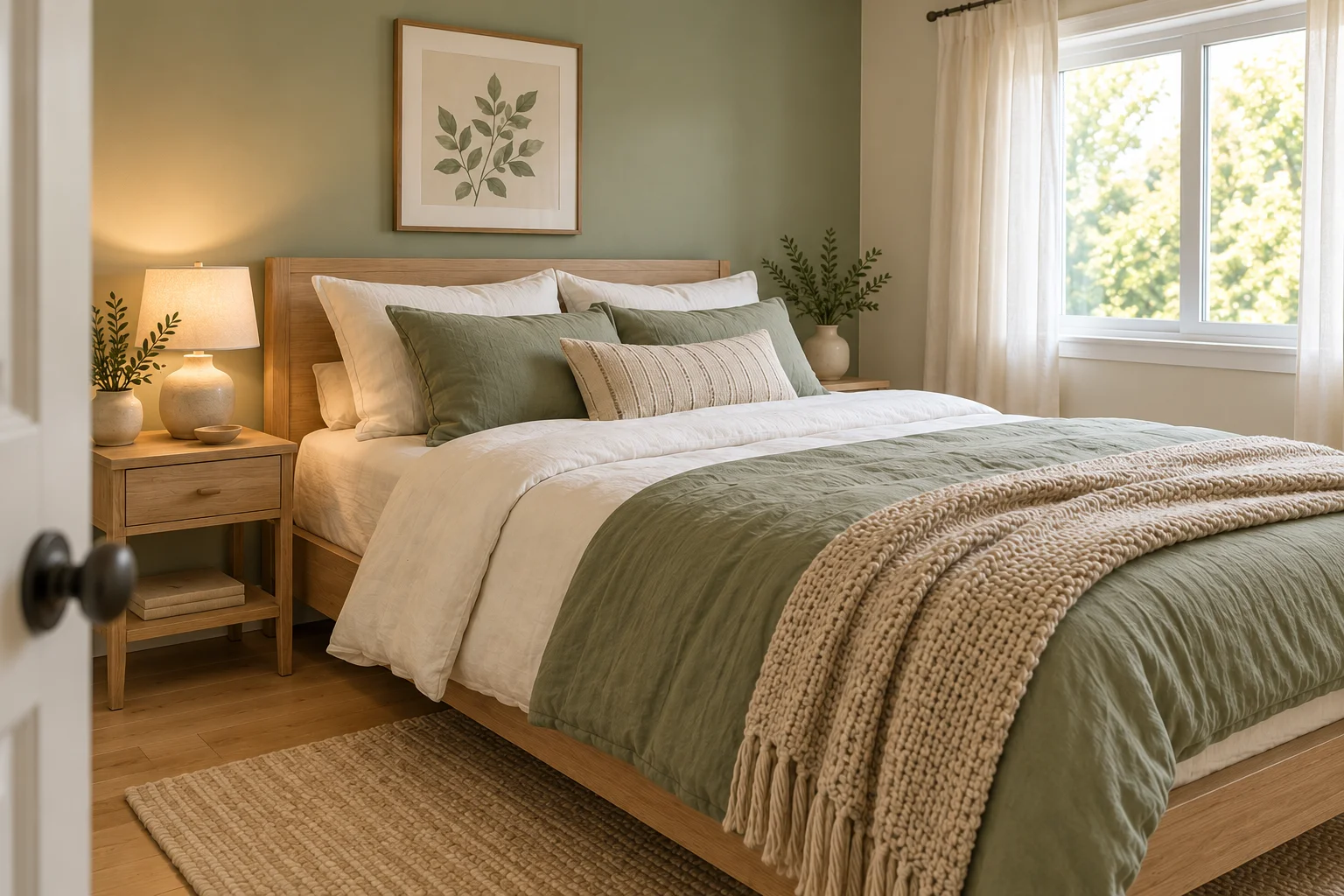
A coordinated bedroom does not need every item to match. Repeating a few related colors can give different fabrics and furniture a shared direction. In this room concept, warm ivory keeps the bedding simple, muted sage brings color, pale oak supplies the wood tone and oatmeal adds a soft texture.
Use the palette as a way to edit what you own before making a shopping list. A room with darker timber or existing cream curtains can take a different version of the same idea. The aim is a coherent combination that suits your daylight, rather than a perfect copy of the illustration.
Warm ivory
Bedding and curtains
Muted sage
A duvet cover or cushions
Pale oak
Furniture and frames
Oatmeal
A throw or rug
In this guide
Use warm ivory as the quiet starting point
Begin with the largest textiles you already like: sheets, a duvet cover or curtains. Warm ivory can sit comfortably beside oak and beige, while a very blue white may create a sharper contrast. Place fabric samples together in the room rather than deciding from separate screen images.
Ivory does not have to mean a fully pale room. A light sheet folded over a sage duvet is enough to repeat it. If pale bedding is impractical for your household, use it in a smaller washable cushion cover or curtain instead. Choose materials and care requirements that suit your routine.
Repeat sage in a few places
Muted green can appear in bedding, a cushion, artwork or a painted surface. Choose one main place for it, then repeat a smaller amount elsewhere. In the illustration, the sage bed textiles connect with the wall and botanical artwork, while the remaining pieces stay comparatively quiet.
If you are keeping neutral walls, try the color through removable textiles first. See how the shade looks beside your existing floor and furniture in both daylight and evening light. Paint names and digital swatches cannot tell you exactly how a color will appear in your room.
Let wood tones connect the furniture
The oak bed and bedside table give this palette a warm structure. They do not need to have identical grain, but their tones feel related. A frame or small tray can repeat the wood color without introducing another large piece of furniture.
Work with an existing darker bed rather than replacing it just to match a mood board. Try fewer competing wood finishes around it, and compare any new piece with what is already in the room. A simple shape and useful dimensions matter more than obtaining an exact decorative match.
Add texture without filling every surface
Oatmeal knit, plain cotton and visible wood grain give the illustrated room different surfaces within a restrained palette. One textured throw can do the work of several decorative cushions. Fold it where it is easy to use instead of styling the bed with more layers than you want to move each night.
Leave part of the bedside surface and the route around the bed clear. If a rug makes doors harder to open or creates an awkward edge, change its size or leave it out. A cozy reference should still support the way you move through and maintain the room.
Try the combination with what you own
Lay your chosen fabrics beside the main wood finish and remove one item that feels unrelated. Photograph the combination in your room for comparison, then check it again in evening light. Note the one missing function or color before deciding whether anything needs buying.
Keep the palette flexible: ivory can lean warmer, sage can be a little greyer and oatmeal can come from a plain woven fabric rather than a chunky knit. The useful part is the relationship between the colors and materials, not reproducing every object.